ShopDreamUp AI ArtDreamUp

Deviation Actions


Description
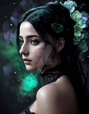
Digital painting for the Stylenoir Monarchy contest.
I'm really pleased with how this one turned out, let me know what you think!
I tried not to use any references, the only one used was while sketching out the skull teeth (Smile)")
Name derived from a novel I just love, Daughter of Smoke and bone. I was stuck for a name, and it kind of just fits well Also, the blue hair ")
Goes without saying, but this one done digitally, hence it is entering the digital portion of the contest
I'm really pleased with how this one turned out, let me know what you think!
I tried not to use any references, the only one used was while sketching out the skull teeth
Name derived from a novel I just love, Daughter of Smoke and bone. I was stuck for a name, and it kind of just fits well
Goes without saying, but this one done digitally, hence it is entering the digital portion of the contest
Image size
2000x2604px 4.41 MB
© 2013 - 2024 mgscreative
Comments49
Join the community to add your comment. Already a deviant? Log In
Really cool and interesting piece. Anatomically it's nearly perfect, most of its problems are in rendering but it's still a very good piece.
Anatomically, everything is perfect except for the ear. Now, arguably the ear doesn't NEED to be showing since the hair is covering it, however the way it's covering it seems a little too convenient and/or unnatural. It also makes the ear look like it might also be a little bit too high up on the skull. The way her hair is pulled up and back into a ponytail, I really feel like it should be off the ear. I mean isn't that usually the way ponytails work? I don't know, I'm a dude and don't usually notice that stuff. <img src="e.deviantart.net/emoticons/let…" width="15" height="15" alt="
As for rendering (that is the way it's painted/sculpted/shaped/shaded/colored) there isn't anything TOO glaring, however there are mainly just some inconsistencies with the shadow areas which make them stand apart from each other too much. For example, considering how the back of the head and the neck fade into black, and that the shoulder area beneath the neck is also completely black, the pony tale feels like it should have more contrast in it or fade towards the same black towards the back and bottom. Additionally with the hair, the way it ties itself up at the top looks a little hastily done.
Otherwise the rendering is well done and consistent except that the colors are too different from each other so everything just looks a bit too... crisp and like it was put together from other scenes. There are different ways to fix this. One way is to take some of the color from each element of your piece (you've mainly got three, the gray from the jaw, tan from the face, and blue from the hair) and bleed or mix them across one another in some areas. You don't have much reflected light so that would be a good place to start. You could take blue from the hair and add a bit to the back of the neck (not too much) as it would be reflecting some of the shine from the hair, same with other dark areas where it would make sense for them to reflect some of the other colors. The idea though is to just make it look more like there is a consistent type of lighting throughout the piece, reflecting off various surfaces and giving the colors a common ground.
The other way this is usually dealt with is to start a piece using a set pallette and only allowing yourself to use the limited colors you've picked plus mixes of them (like you would in a traditional painting). This forces you to use the same colors in different ways for different elements which usually takes care of the problem without even having to worry about it too much. It's too late to do it that with this piece of course, but it may be something you'd want to try in the future.